

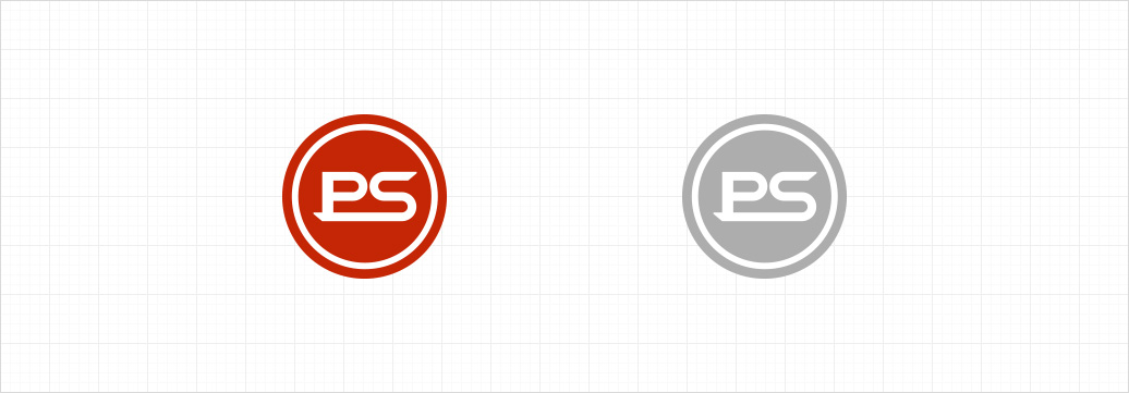
PS Tec's symbol mark incorporates the English initials "PS" of "Poongsung" to concisely convey the corporate image, and the shape
of the letterforms represents the connection between the company and its customers.
Using red as the main color to emphasize dynamism and creativity, PSTec's visual style showcases the customer-centric
professional service spirit that illuminates the world, represented through a circular motif.
The Korean logotype is complimentary to the symbol mark, and serves as a foundational element that conveys Communication in a concrete manner. The Korean logotype employs a modern Gothic typeface to convey a consistent image of creativity and ambition of PS Tec, and utilizes an italicized style to impart a sense of dynamism.


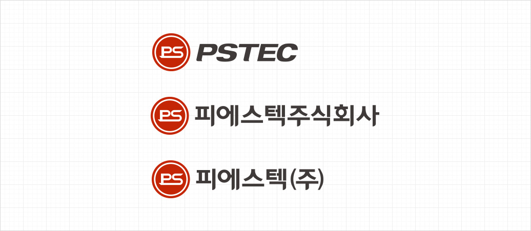
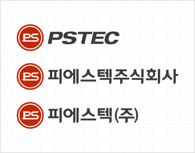
The Corporate Signature in a horizontal arrangement refers to the combination of the symbol mark and logotype aligned side by side in specific proportions. In this case, the symbol mark serves as the primary emblem, while the logotype acts as a component that clearly identifies the company name. Refer to the spatial regulations and proportions outlined in this section when utilizing the corporate signature.

The dedicated color is applied to the mark, logotype, and various media to establish PS Tec’s unique color identity and convey a consistent image.
- Main Color
- Spot Color : PANTONE 1805 C
- Process Color : Magenta 91% + Yellow 100% + Black 23%
- RGB Color : R 196 G 18 B 0
M91 + Y100 + K23
- Sub Color
- Spot Color : PANTONE PSTEC Gray
- Process Color : Black 90%
- RGB Color : R 26 G 26 B 26
K90
C46 + M38 + Y36 + K4
C41 + M47 + Y77 + K7
 PANTONE Cool Gray 9C~1C